
1
Send to the shared area
When one item or a multi-selection is active, the shared-area button can copy the selected part from the workspace, group, true/false action branch, dialog, and variables surfaces into the device-local library.
No-Code Workspace — Block Reference
Shows a form that collects settings and choices
Documented for app version 1.0.50Updated:
Block Preview
Captured from the in-app Visual Builder block card in the English UI.
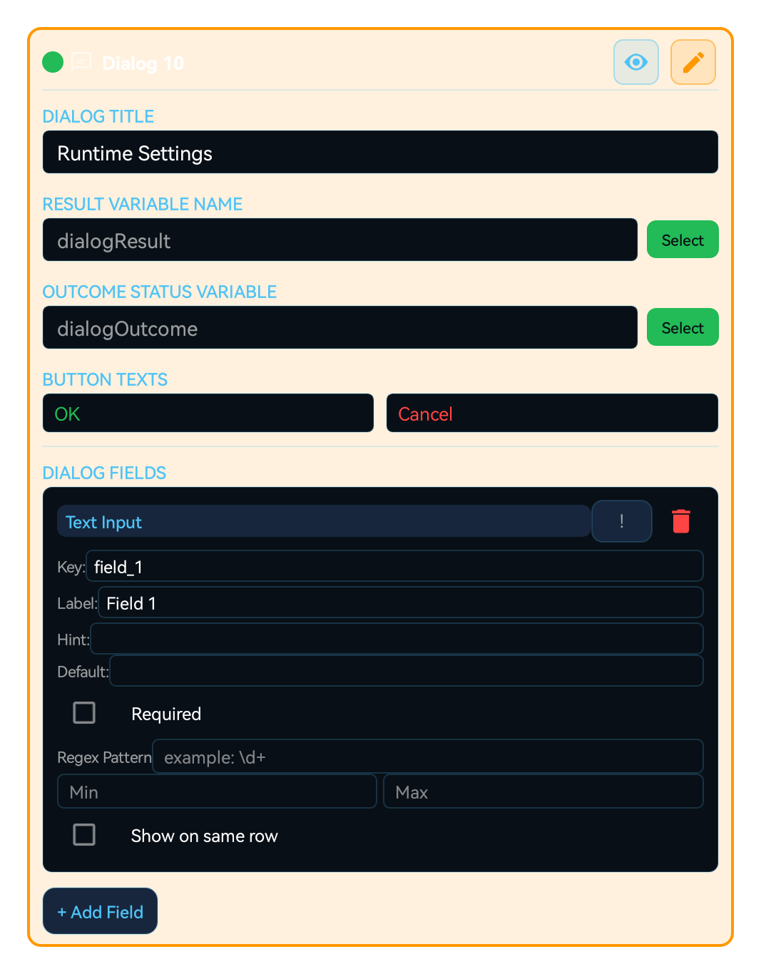
Shows the user a form and writes each field's value into a variable. The macro-start Dialog is built in the workspace's Dialog section (Settings → Dialog; pages, Single Dialog or Separate Dialogs); the DIALOG block opens a form mid-flow and adds a timeout and result variables. Field types: info text, text input, checkbox, radio group, dropdown, multi select, tag, signature, image picker, color picker, file picker, date time, number range, slider, tab group, recorder picker, description, and spacer. Each field's look is set with Button design and runs exactly as previewed.
When dialog output is captured into a result variable and routed into compare, KV, or HTTP steps, the dialog becomes a real data-collection step.
Use it to:
Ask for a repeat count, duration or mode at macro start
Ask for a confirmation or new choice mid-run
Run or skip blocks based on a choice (Dialog conditions)
Let the user pick an image, color, file, signature or recording
Open the workspace's Dialog section for a macro-start form, or add a DIALOG block for a mid-run form
Enter the Dialog title and the Positive/Negative button texts; empty button text uses the device-language default, and an empty title shows no title
Add fields; values appear in the lightbulb's variable list with a _dlg_ prefix (e.g. _dlg_repeat)
Field appearance → Button design: style, indicator mark, design coverage, colors and effects
Check it with Preview
Title and Positive/Negative button texts
27 styles; indicator mark for checkboxes, radio groups and multi-selects; design coverage (indicator only / full control surface); color, shadow, glow. Empty colors follow the theme
Sharp, Rounded or Oval; button color, corner radius and height are set separately
All field values on the DIALOG block
"confirmed" or "dismissed" (cancel, Back, timeout)
DIALOG block only; 0 = unlimited, up to 24 hours
Navigation setup editor and Agent Detect references: a saved setup, route or reference set is picked and edited from the Dialog
| Parameter | Description |
|---|---|
| Dialog title and buttons | Title and Positive/Negative button texts |
| Button design | 27 styles; indicator mark for checkboxes, radio groups and multi-selects; design coverage (indicator only / full control surface); color, shadow, glow. Empty colors follow the theme |
| Dialog corner shape | Sharp, Rounded or Oval; button color, corner radius and height are set separately |
| Result variable | All field values on the DIALOG block |
| Outcome status variable | "confirmed" or "dismissed" (cancel, Back, timeout) |
| Timeout (ms) | DIALOG block only; 0 = unlimited, up to 24 hours |
| Navigation and Agent Detect fieldsComing soonv1.0.51 | Navigation setup editor and Agent Detect references: a saved setup, route or reference set is picked and edited from the Dialog |
Scenario: Startup settings
Dialog section → Text Input key=repeat, Radio Group key=mode (Fast / Careful)
Bind the GROUP repeat count to _dlg_repeat with the lightbulb
Add a Dialog condition from the speech bubble to the block that should run only for Careful
COMBINATIONS:
Dialog conditions: Run or skip blocks by choice
DIALOG + SWITCH_CASE: Branch on a choice
DIALOG + COMPARE: Stop when the outcome status is "dismissed"
Shows a form that collects settings and choices
WARNING:
A checkbox returns true/false, other fields return text; use tonumber() for numbers
On cancel, Back or timeout, fields return to their defaults and the macro continues
Deleting a field also deletes the Dialog conditions that use it, so the block runs unconditionally; a condition on a disabled field is a validation error
The same block at three levels: a quick start, the real options, and professional techniques.
Dialog shows the user a form while the macro runs and writes each interactive field's value into a variable. For settings you want to ask at macro start, use the workspace's Dialog section (Settings → Dialog): you set the Dialog title, the Positive and Negative button texts and the fields there, and the eye icon decides whether the form is shown when the macro starts. When the flow needs a new choice or a confirmation midway, add the Dialog (DIALOG) block; it uses the same field types and adds a timeout and result variables. Field values appear in the lightbulb's variable list under their _dlg_ names (e.g. _dlg_repeat), so you pick one there and bind it to another block's setting.
Field types: Info Text, Text Input, Checkbox, Radio Group, Dropdown, Multi Select, Tag, Signature, Image Picker, Color Picker, File Picker, Date Time, Number Range, Slider, Tab Group, Recorder Picker, plus the display-only Description and Spacer. Each field takes a label, hint, default value, required flag, validation pattern and minimum/maximum, and a visibility condition shows or hides it based on another field's value. The Field appearance → Button design designer styles every field on its own: 27 styles for the Control surface (Classic, Neon Gaming, Glass, Metal, Outline, Holographic and more); for checkboxes, radio groups and multi-selects also an indicator design and an Indicator mark (Tick, Core dot, Diamond and more); Design coverage applies the style to the indicator only or to the full control surface. Control colors and effects sets the label, text, selection, background and border colors, the label shadow, and the control glow and shadow. Colors you leave empty follow the active theme, and Reset all colors returns to it. Save a design you like under Saved control designs and apply it to other compatible fields in one tap. For the dialog itself you choose the Dialog corner shape (Sharp, Rounded, Oval) and the text, background and border color, corner radius and minimum height of the Positive and Negative buttons. The design you see in preview is kept exactly in the live dialog.
Choose between the two surfaces deliberately. The macro-start Dialog is asked once, supports several pages, and the book icon on the page strip switches between Single Dialog (pages become tabs) and Separate Dialogs (pages are asked one after another); it is the cleanest way to collect every setting up front and then run uninterrupted. The DIALOG block asks for a decision mid-run: its outcome status variable becomes "confirmed" on confirm and "dismissed" on cancel, Back or timeout, so check it with COMPARE and end the flow cleanly on cancel. On unattended macros set Timeout (ms) (0 = unlimited, up to 24 hours); when it expires the cancel path runs and the fields return to the defaults you set in the editor. The timeout exists only on the DIALOG block, never on the macro-start Dialog. A checkbox returns true/false and every other field returns text, so convert with tonumber() before a numeric comparison. To run a block only for a specific choice, add a Dialog condition from the speech bubble on that block; all conditions on one block must hold at the same time.
Small, reproducible examples that combine several blocks — build them straight into your own macro.
This block is useful on its own — but it shines when paired with the right partners.
Runs or skips a block based on a checkbox or selection field, turning choices into flow without building a separate COMPARE branch.
Routes a Radio Group or Dropdown value straight into branches, cleaner than stacked COMPARE blocks.
Stops the macro safely when the DIALOG block's outcome status variable is "dismissed".
Binds a field value to any block setting such as a repeat count, wait time or coordinate.
Stores the user's choices so the next run can read them back with KV_GET.
Treating a text input as a number. Every field except the checkbox returns text, so comparing "5" and "10" as text gives the wrong answer. Fix: convert with tonumber() before comparing.
Giving two fields the same key. Duplicate keys overwrite each other's values. Fix: give every interactive field a unique key (Info Text, Description and Spacer need none).
Assuming that deleting a field quietly switches conditions off. When a field is deleted, the Dialog conditions and bindings that point at it are removed too, so the block now runs unconditionally. If the field is only disabled, or the option a condition expects no longer exists, project validation reports an error and the block is marked invalid. Fix: review conditional blocks after deleting a field.
Coming soonv1.0.51Not rechecking checkbox conditions in older projects. The condition editor now shows the state in which the block actually runs, as Selected or Not Selected. Fix: open checkbox conditions you built in earlier versions once and confirm the chip shows the state you intend.
Split crowded forms: add pages to the macro-start Dialog and use Single Dialog for one tabbed window or Separate Dialogs for a step-by-step wizard; in the DIALOG block, Tab Group, Description and Spacer do the same job.
Combine a validation pattern with the required flag: an empty required field or a value that fails the pattern never reaches the flow; the field falls back to the default you set in the editor.
Coming soonv1.0.51Two new field types let the user edit saved macro data from the Dialog: the Navigation setup editor edits a saved map, marker and route and returns the setup and route selection without moving the character. Agent Detect references lets the user pick a saved reference set or add and edit references; Save confirms the Dialog selection, and only this macro's saved images or cutouts can be used.
Coming soonv1.0.51When you replace a field with another type, check its value family: Radio Group, Dropdown and Tab Group can replace each other, as can Number Range and Slider, and Info Text and Description. In that case the value and rules are kept. Switching to a different value type clears the previous value, validation rules, the conditions that depend on that value and its bindings; other blocks are kept. Renaming a single option carries its conditions to the new name; reordering, adding or deleting options never redirects a condition to another option.
Coming soonv1.0.51In landscape the button designer shows the preview on the left and the settings on the right; in portrait the preview sits above the settings. Each pane scrolls on its own.
The Lua below is what the Code Editor generates for this block with sample settings. Adding cases, branches, actions or loops, or changing settings, extends the generated code accordingly. Study it to see what the block does under the hood, to learn Lua, or to copy and adapt it. Use the Copy button (top-right) to paste it into the Code Editor, or “Try in Editor →” to run it in the live editor.
local dialogResult = nil
local _dlg_confirm = nil
local _dlg_name = nil

dialogResult = Setting.builder():add("confirm", Checkbox(false, "Onay")):add("name", EditText("", 1, "Ad", "Adınızı girin"):runtimeCoordinateBinding("NONE", "")):setPositiveButton("OK"):setNegativeButton("Cancel"):build():show()
if type(dialogResult) == "table" then
 _dlg_confirm = dialogResult["confirm"] ~= nil and dialogResult["confirm"] or false
 _dlg_name = dialogResult["name"] ~= nil and tostring(dialogResult["name"]) or ""
else
 _dlg_confirm = false
 _dlg_name = ""
end
local _mh_dialog_field_00000000_0000_4000_8000_000000000001 = _dlg_confirm
local _mh_dialog_field_00000000_0000_4000_8000_000000000002 = _dlg_name
Note: generated code can evolve across versions; helper names (e.g. _reg1, m1) and internal optimizations may change. The logic and the called APIs reflect the block’s behavior.
The guidance below is not identical for every block. It summarizes the professional controls that most often repeat in the selected block family.
Define TRUE/FALSE, try/catch, and loop exit behavior before chaining more blocks.
Keep it explicit where group, dialog, and loop variables are created and where they are consumed.
Long flows become brittle quickly without timeouts, ASSERT blocks, BREAK logic, or explicit guards.
Moving repeated steps into GROUP and GROUP_CALL improves readability in larger projects.
TOUCH and TOUCH_BREAK cover recipe-style touch flows. Raw pointer choreography such as Touch.down, Touch.move, Touch.up, Touch.dispatch, Touch.reset, Touch.breakAll, and Touch.releaseAfter is not exposed as a first-class builder block.
Touch.downTouch.moveTouch.upTouch.dispatchTouch.resetTouch.breakAllTouch.releaseAfterThe DIALOG block and dialog designer cover a bounded field set in the builder: Info Text, Text Input, Checkbox, Description, Radio Group, Dropdown, Multi Select, Tab Group, Date Time, Number Range, Slider, Image Picker, Color Picker, File Picker, Recorder Picker, Tag, Signature, and Spacer. The buttons are designed too: the Positive button and Negative button tabs set each button’s text, background, and border color, corner radius, and minimum height next to a preview. Freer Setting.builder composition, multi-step wizard flows, and mixed HUD/dialog choreography still do not map 1:1 into the builder.
Coming soonv1.0.51Two more fields: Agent Detect references (agent_detect_editor) lets the user pick a saved reference set or add and edit references, and Save confirms the selection; Navigation setup editor (navigation_editor) edits a saved map, marker and route from the Dialog and returns the setup and route selection without moving the character.
Setting.builderDialogHudTextViewAgentDetectEditorNavigationEditorHTTP_GET, HTTP_POST, and HTTP_PUT cover common fixed-method flows; HTTP_REQUEST covers one bounded request with method, header lines, body, content type, query parameters (GET and DELETE), timeout, and a bounded retry. These blocks never throw; they write the status code (-1 on a network failure). Cookie handling, chained request objects, and lower-level client flows still need the code editor.
Request()Request.setCookieRequest.getCookiesCUSTOM_CODEThe MAP, LIST, JSON_PARSE, REGEX_MATCH, and METRICS blocks cover the everyday cases: map actions, a static list, reading a value from a JSON path, regex match, find, replace, and split, and metrics actions. The rest of the Map, Array, JSON, Regex, and Metrics APIs (for example Array sort, filter, and map) is broader than the builder recipe model and stays on the CUSTOM_CODE and code editor side.
MapArrayJSONRegexMetricsRuntime helpers, raw Request objects, Lua built-ins such as print/pcall/xpcall, and free-form object chaining patterns are represented through CUSTOM_CODE or the code editor.
RuntimeRequestprintpcallxpcallCUSTOM_CODEEach block card now exposes an independent breakpoint toggle. When enabled, the breakpoint preference is stored with the block.
Breakpoints are only emitted into runtime code when Debug Mode is enabled from Visual Builder settings. When Debug Mode is off, breakpoints stay saved but do not pause execution.
Use ASSERT for fail-fast validation, and use breakpoints for step-by-step tracing and controlled pauses in the same flow.
Variables defined with SET_VARIABLE are accessible throughout the macro (global scope). All blocks can read/write the same variable.
However, a variable defined inside a GROUP will be 'nil' (undefined) until the GROUP executes. Blocks outside the GROUP using this variable may produce unexpected results.
FOR_EACH loop variables (item and index) only carry valid values inside the loop body. Outside the loop they are outside local scope and should not be used.
TRY_CATCH error variable is only valid within the catch block. If the try block succeeds, the catch branch is not entered and the error variable remains undefined.
TIP: Before using a variable inside a GROUP, assign a default value with SET_VARIABLE outside the GROUP. This way the variable won't be nil even if the GROUP has not run.
You can embed variable values and calculations into text fields using {{ expression }} syntax. Expressions inside double curly braces are evaluated as Lua code and the result is inserted into the text.
{{ expression }}Skor: {{ score + 1 }} → "Skor: " .. tostring(score + 1){{ name }} kazandı! → tostring(name) .. " kazandı!"X:{{ x }} Y:{{ y }} → "X:" .. tostring(x) .. " Y:" .. tostring(y)Expressions are checked by the sandbox policy. Security-sensitive calls like loadstring, require, debug are automatically blocked.
Keep scan regions as small as possible — improves speed, reduces false matches.
Always add an exit condition when using infinite loops (BREAK, timeout, or conditional exit).
Use network operations and error-prone steps inside TRY_CATCH.
If you need global error handling, use the Error Handler (ERROR_HANDLER) block as a singleton in the project.
Small coordinate offsets (CLICK/SWIPE) improve tap accuracy across different DPI and screen scales.
Customize macros with Dialog block — different parameters each run.
Define repeating steps once with GROUP_CALL, call from many places.
Cross-macro local library
The Local Shared Macro Area moves blocks, variables, dialog fields, gallery assets, and imported media dependencies between macros on the same device. It is device-local, not cloud sync, not Firebase sharing, and not a replacement for public macro sharing.
Professional usage model: put a reusable login flow, common scan region, shared dialog form, variable group, template image, color profile, replay recording, or imported PLAY_SOUND media file into the shared area from one macro, then import it from the relevant + menu in another macro.
VISUAL_BLOCKSVARIABLESDIALOG_FIELDSTEMPLATE_IMAGECOLOR_SWATCHREPLAY_RECORDMEDIA_FILEWhen one item or a multi-selection is active, the shared-area button can copy the selected part from the workspace, group, true/false action branch, dialog, and variables surfaces into the device-local library.
The shared-area entry under the + menu imports the selected item into the surface that opened it. Main workspace, group, action branch, dialog, and variables each receive the compatible item type.
Gallery items include template images, color swatches, replay records, and imported audio/media files. They can move between macros on the same device so repeated templates, colors, recordings, and PLAY_SOUND media assets do not need to be captured again.
The shared area is not a permanent dumping ground. Delete stale shared items from the shared-library panel; imports create a copy in the target macro and do not rewrite the source macro flow.
AI assistant
Tell MH AI what you want in plain language; it proposes the right block sequence and lands it in the workspace after you approve. In the current release it works with cloud providers such as Gemini, Claude, and OpenAI; on-device local models are on the roadmap.